I just updated from v25.7.29.2536 to v25.10.29.3062 in Windows (stand-alone free version). This my first look at the new UI, and I understand from the forum that it’s based on something called Electron (which I know nothing about).
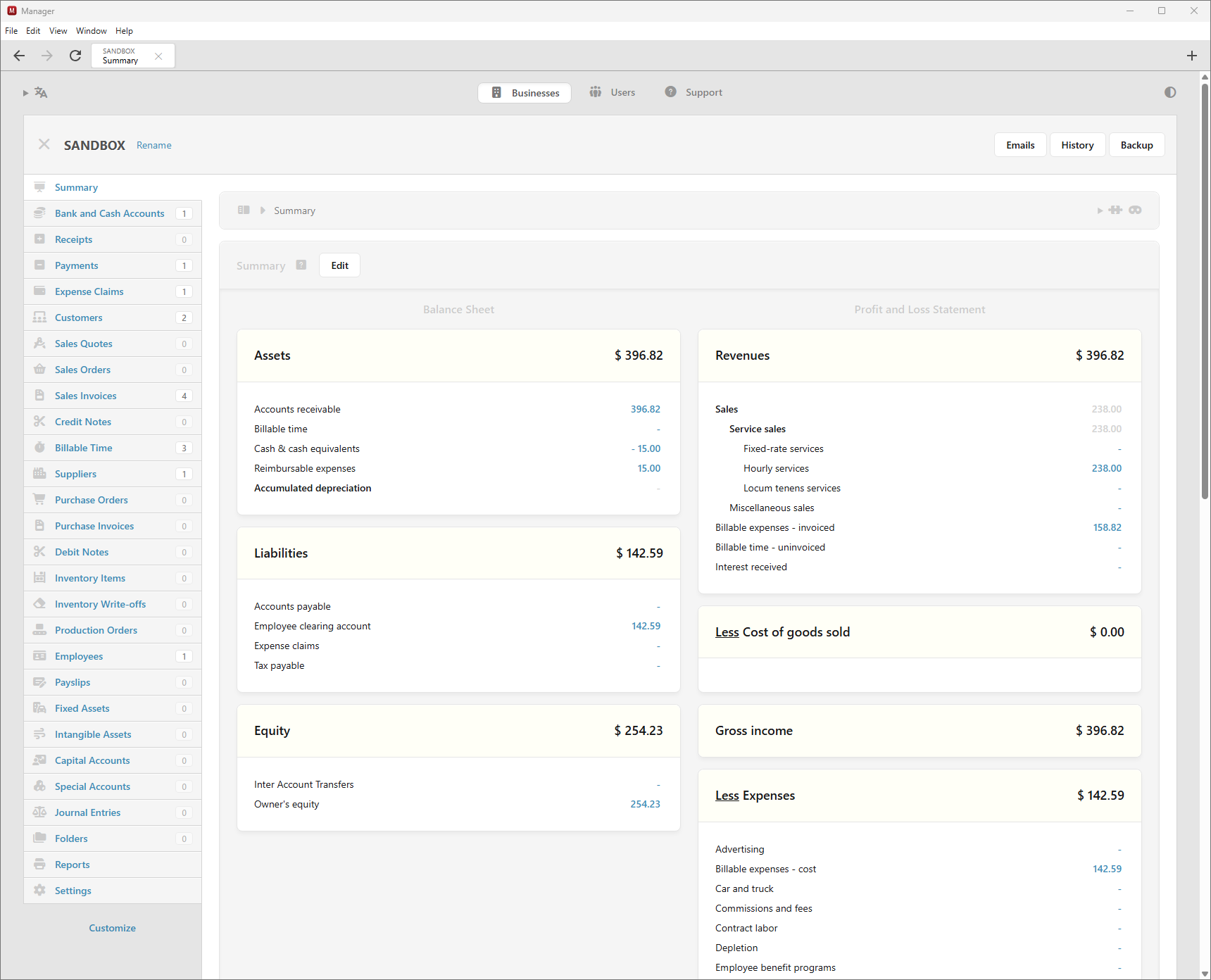
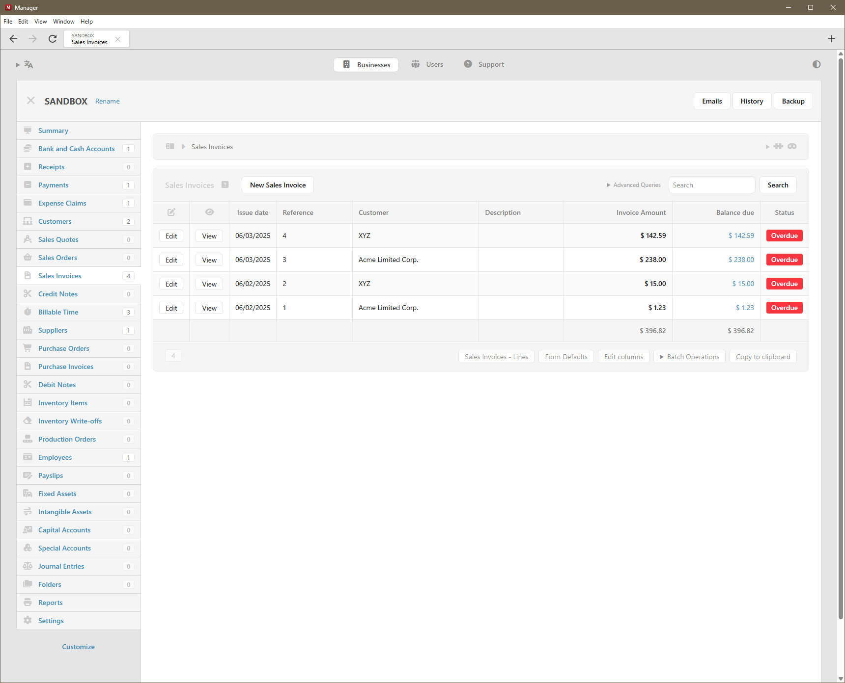
Is the new UI really supposed to look like this? Scaling and spacing are all wrong on my computer. Invoices are all squished to one side of the screen, and not at all WYSIWYG anymore. There’s way too much white space everywhere (like on the Summary, which no longer fits on a single screen for me, and on lists like the Sales Invoices list). The line-item fields on the Sales Invoices entry screen are all far too narrow and far too tall. The UI’s scale and spacing are overall just highly inelegant now, at least on my computer.
Is this just something with my particular screen size and resolution that others aren’t experiencing? Is this a work in progress that will eventually look as elegant as it used to, or is this just how the new Electron platform is with benefits to the program somehow outweighing the damage to the look and feel? What’s the latest version before this big change, and is there a way to download and reinstall that version? (I have a backup of my .manager data file from before I updated to 25.10.29.3062.)
@Ealfardan, can you please point me to some information on this change in how Themes works so I can de-squish my invoice display? I can’t find it discussed anywhere.
Is the font user-configurable? I personally consider screen real-estate to be more valuable than a “smoother” font. I’d like to change the font back to whatever it was before if that would keep things on my screen from being so spread out that they require scrolling.
And what about the very narrow line-item entry fields in invoices? Is that also caused by the change in Themes or font somehow? If not, is there any way to fix that?
@Jon previously the size of form fields have been hard-coded and that was causing issues for users with many custom fields and narrow screens.
Also, in the latest version, even though Description field is smaller, once you start typing more text, it will keep expanding as much as required. Something that older version didn’t do. So when editing screens with a lot of content, there should be less scrollbars within elements.
The same with entering amounts. If amount does not fit the allocated space, the field will automatically expand (previously if the amount did not fit hard-coded allocated space, the field would hide overflowing content).
It’s not fair comparing empty state. Compare how edit forms look like when they are full of content. You will see big difference between older and newer version. For example, here is what happens when description field contains a lot of text:
See? It will take advantage of all the available space. Something that older version didn’t do because field widths have been hard-coded. They are not hard-coded anymore. They are fluid.
Could I make minimum default widths wider? I could but it’s tough to figure out where to draw the line. There will be always someone who says “make it wider” and another person “it’s too wide! can’t see all my fields anymore”. So objective way to determine how much space to give the fields is how much they actually need.
Thanks, @Lubos. That’s actually quite cool! I hadn’t tried typing in the fields. I love how they expand as I type! Very slick indeed.
But, is there any way for you todecrease the height of the fields? On my extra-wide display, it’s vertical real estate that’s at a premium. Also, the extra-tall fields look off when filled in, with some of the fields being vertically aligned to the top and others to the center:
May I ask, @Lubos, if the extra vertical white space throughout the UI is indeed due to the new font, is there a way for me as an end-user to change the font back on my end? As I wrote above, vertical space is at a premium on my monitor, so I need to keep lines compact and nicely spaced together, as they were pre-Electron. Especially with the two new rows of stuff at the very top of the UI (menu bar and navigation/tabs bar) and the double-height invoice fields, significantly less fits on each vertical screen now, and I’m having to scroll vertically much, much more often.
Finally, I’ve also confirmed what @Ealfardan wrote above, that the issue with invoices appearing all squished to the left third of the screen is related to Themes . When I turn my custom Sales Invoice theme off, the invoice preview no longer appears squished. So what do I need to do to my (many precious) custom themes to fix this? They worked perfectly with v25.7.29.2536 (pre-Electron) and before, but now they’re broken. I don’t want to ruin them by trying to fix what I don’t understand. Any help?
To give an idea of the impact of the vertical spacing issue, here are screenshots of the Summary screen (with fake data) before and after Electron, at the same resolution and window size (full screen height, half screen width). As you see, 8 more rows fit onto the first screen before than do after:
It’s only description field which is causing things to be vertically taller. I will make description field 1-line height like before.
This is web-browser limitation. Textarea field text will always start at the top and input field text will be always vertically centered and there is no way to make it consistent. My solution is to convert all the text fields to textarea because that’s the only way it can be all aligned (at the top).
Yeah, I agree on this point. If I’m making everything compact horizontally in empty state, the same principle should be applied vertically too. Empty textarea should not be 2 lines tall.
So the way custom themes are implemented now is that they run within IFRAME completely isolated from the main app. Previously CSS from the main app was leaking into themes and I couldn’t change CSS in the main app because many themes started to rely on those CSS leaks.
The new approach is that no CSS leaks into theme which means if your theme relied on any CSS from the main app, it would break. But future-wise, once the theme is correct under new IFRAME approach, it won’t break no matter what changes I will make to the main app. So that will bring more stability.
If you don’t know how to fix the current theme, then just wait for new themes. I’m working on version 4 of custom themes which should be the easiest approach. The issue with previous 3 versions of custom themes was that it was always all or nothing. Even if you needed to make one adjustment to default theme, you needed to have custom theme with 100 or 200 lines of code. Version 4 is changing this and most custom themes would be just a few lines of code. This also works very well with AI which can write that code to achieve your goal. Not to mention, version 4 of custom themes allows to modify the look of any printed document, including reports.
Electron app has tabbing support which old version didn’t have.
Also there is breadcrumb element showing on every screen. But I’m planning to merge the panel where it shows business name and breadcrumb into single element eventually. So that will save some vertical space in the future.
Yeah I think padding is more in Electron version. But this is not a change of font. When I’ve added dark mode, I needed to rewrite a lot of UI and although I tried to do it as close as possible, it’s not exact. I think table cells should have less padding because more padding is increasing their width horizontally too.
Thank you, @Lubos. I’ll look forward to all of this. Perhaps I’ll stick with v25.7.29.2536 for now and wait for a few new versions for the dust to settle, then I’ll take a look at the improvements on a VM and see what I can do with my themes before migrating. Any suggestion of when I should try again, to see the optimization of vertical spacing as well as version 4 of custom themes?
Hmmm… @Lubos, respectfully, I don’t think absence of CSS leakage is what’s causing the invoice display issue I’m experiencing. When I print my custom-themed invoice in the latest Electron version on paper or to a PDF, it prints perfectly as expected and is identical in every way to what I got pre-Electron. No difference there, so the custom theme itself must be intact, no?
The difference is in how the invoices are displayed (Sales invoices>View), not in how they’re printed. In the on-screen view of the invoice, it comes out all squished into the left one-third of the display area, as shown in the screenshots. Each cell in the invoice table comes out very narrow, so the contents wrap onto multiple lines. It doesn’t print that way, it only looks that way in the View rendering. How could a change in the scope of CSS in custom themes cause the View version to be so messed up but not affect the Print version at all? (I’m not using any display-specific/print-specific CSS that I’m aware of.)
I may be going outside my knowledge zone here, but since I see this issue only with my custom themes and not with the standard theme, could there be some sort of new conflict caused by the CSS that the Electron version wraps around the on-screen View rendering of invoices, rather than with the CSS in my custom themes themselves? Is there some new CSS in the View wrapper that wasn’t there before that I need to override now in my custom themes? Or conversely, is there some CSS marked !important in the wrapper’s table/box model that previously wasn’t marked !important? I can’t think of another reason Electron might have broken the on-screen View for my custom themes without breaking the printed version of the same themes.
.
Screenshots:
The custom-themed invoice is squished to the left of the screen with very narrow columns when viewed on the screen post-Electron (it was fine pre-Electron)…
Any thoughts on this, guys (@Lubos@Ealfardan)? From the screenshots I posted above, showing the difference between the printed and the displayed versions, do you still think this is a Custom Themes issue related to CSS leakage? I haven’t been able to solve it. Nothing in my theme suggests it’s relying on CSS from above or would explain the difference between the printed and displayed layouts.
@lubos I need to upgrade from Themes V1 with a number of specific customization in multiple businesses, it sounds like I should wait for V4. Do you have any timeline for V4 release, is it days / weeks or months?
My comment here is when I put the account for Sales Revenue the description automatically remove so I will copy again and paste.. but for the other 2 companies it didn’t delete..