Audit Trail page needs to be wider (Cloud/Server only)

Currently the Audit Trail page is very squished up, it doesn’t make good use of the page width. This makes it harder to read at a glance.

Here’s a screenshot:

This looks a lot better if we make it wider (notice, in particular, the date/time values):

I managed to achieve this by modifying the in-line CSS.

From 600px:
<div style="width: 600px; margin: 0 auto">

To 850px:
<div style="width: 850px; margin: 0 auto;">

The new width doesn’t need to be 850px exactly - but something greater than 600px would be highly appreciated.

3 Likes

How do I find the css file you’ve mentioned?

It’s in-line, in the HTML source (not an external CSS file). I modified it using dev tools / inspector on Google Chrome for testing purposes - it’s only a temporary change, as soon as the page refreshes it changes back.

So this change would need an update to Manager itself.

1 Like

This looks like a text wrapping issue possibly.

Yep. It’s based on the surrounding container not being wide enough, and so the text is made to wrap to the next line.

:+1:

Fixed in the latest version (17.11.1)

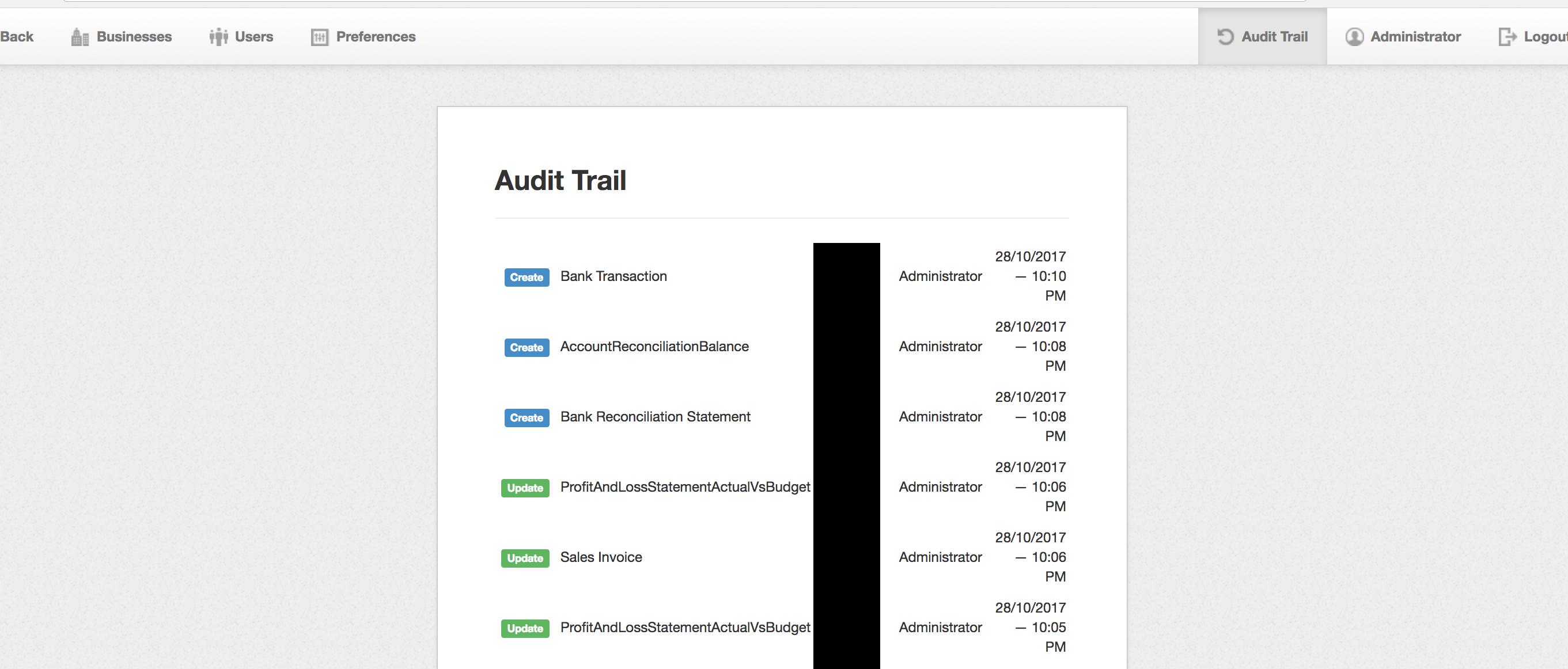
Currently I don’t find audit trail that useful. It shows limited information of activity. I’d like to make it so you can drill down into each activity and see what exactly has been changed and possibly revert it too (if desirable).

4 Likes

Thanks lubos!